Kry - Brand Repositioning (2019-2020)
Kry - Brand Repositioning (2019-2020)
Moving from a tech solution to a meaningful purpose, the Kry brand did a major overhaul including a visual identity to inspire the future direction of patient centered Healthcare.
Moving from a tech solution to a meaningful purpose, the Kry brand did a major overhaul including a visual identity to inspire the future direction of patient centered Healthcare.
Moving from a tech solution to a meaningful purpose, the Kry brand did a major overhaul including a visual identity to inspire the future direction of patient centered Healthcare.
Overview
In 2019, as Kry was becoming established and taking bigger steps towards the vision of a modern, patient-first healthcare service - the need for a new brand position was big. In a great collaboration between Brand Marketing, Product Design and our Brand Identity Agency, Kry set out to do a substantial overhaul of the brand platform and visual identity in the middle of a fast paced product development phase.

Before: Logotype, color palette, iconography, messaging, tonality, user flows - it was all in need of an updated, cohesive and meaningful packaging
My role
As Head of Design in the R&D Department, I collaborated with the Creative director in the brand marketing team, around the initiative. We were the main drivers of the project, which involved Brand Agency Identity Works and Stakeholders in the management team.
The challenge
While the narrative of the brand platform delivered by Identity works was stellar, the path to define the visual identity was a tricky balancing act - leveraging the bold expression in marketing, staying consistent thorughout multi-channel implementation (physical spaces and digital products), and making sure the UI could be updated in a feasible way during a hyper scaleup phase, and adhere to all requirements on accessibility.
This required an open and well-coordinated joint effort between the project group, the agency, the two design teams and the whole organisation.
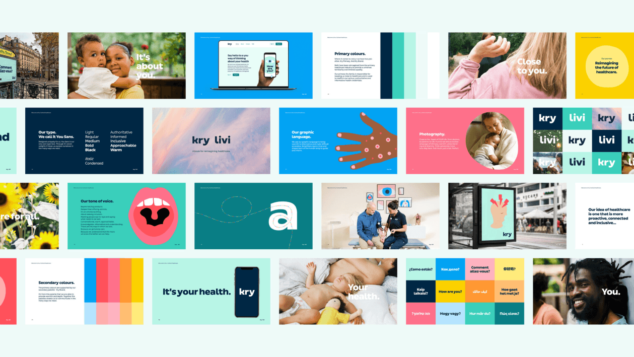
After: Throughout all touch points of the experience, digital and physical, the new brand focuses on a distinguished tone
The approach
Once the brand platform and first take on the brand identity was presented by Identity Works, my team started to work on feasibility testing the identity leading to iterations on logotype, font, iconography, illustrations, colors - and working on aspects like accessilibity, color contrast, funtional color system.
The team ended up tweaking most of the aspects of the identity, and in collaboration with the brand marketing team ensured that the roll out of the new brand platform was scalable from the digital interfaces all the way to physical environments and marketing. A true team effort which had a big impact on the expression of Kry.
The project was done in a focused and timeboxed effort, and even though a lot of crucial things were happening simultanuously the teams managed to deliver a full multi market roll-out within the set timeframe.
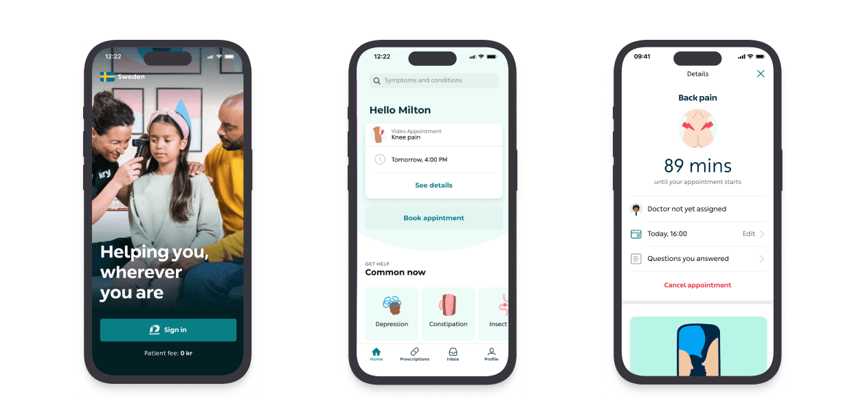
After: Examples of screens with the new brand identity
Impact & Learnings
Brand positioning is a crucial and often challenging task for companies, and while the setup for this initiative was really good with great people and a clear plan - we still faced a lot of challenges throughout the project.
One was finding the right balance in involving our internal designers at the right time and the right amount of time, during an extremely busy period for the company.
One was coordinating the timelines and expectations for the roll-out. The biggest learning was that with high ambitions, open minds and a desire to collaborate you can overcome most hurdles.
How do you measure the impact of brand and visual identity? Well, for one it's connected to the overall awareness, understanding and trust for the service, which were measured continuously and saw a significant positive impact connected to the period following the roll out.
Another aspect is usability and accessibility - where a large number of improvements were made as part of the update - securing contrast in color palettes, typography and the UI - clarifying functional colors, icons, illustrations and UI elements (forms, CTAs, typography, margins, states etc), which led to improvements in experience metrics such as time to task completion, time needed to understand a page, task completion ratio, and overall satisfaction scores.
Finally, as a vanity metric, I am very proud of this effort leading to a nomination for best new brand identity in the Swedish design awards (svenska designpriset).